Walmart Embraces Amazon MCF: A New Era of Cross-Platform Fulfillment for eCommerce
Walmart Embraces Amazon MCF: A New Era of Cross-Platform Fulfillment for eCommerce

There are multiple Landing pages you might have come across, but each one has a different strategy when making one. All the landing pages might be distinct, but they are all aimed at converting visitors to customers. Then, why do some Landing pages work, and others do not? Many of you might be wondering as to how sometimes an elementary landing page works for the audience.
Well, I hope this article will answer all your questions and help you create an excellent Landing page.
Let’s begin
Many people confuse the need for Landing pages restricted only to marketers and bloggers who sell products. That is so not true.
Each of you will require a Landing page at some point in your life, so let’s get into the basics of building one.
Building a Landing page becomes more convenient when you have established a few factors:
What do you think is the perfect situation when visitors are on your Landing page. Every landing page has a motive. What is your content strategy for the Landing page? Which step do you demand from your prospective customers? Do you want them to fill up a form? or Sign-up for newsletters? or even purchase a product. Define your goals; if you don’t, you can’t track your achievements.
Of course, you have a strategy, but peeking into somebody else’s won’t do any harm. See what kind of tactics they are using for success. Get inspired and use their ways. There are three questions you need to take care of. Who your competitor is?. What they are doing for their success? and how can you copy them in your own style?. Check the keywords they are using for landing pages and do a competitive analysis to know where you stand.
Who is your audience? What do they do? What are their ambitions and desires? You need to understand your audience to write a compelling copy that resonates with them and speak to them in their voice.
Now that you know the basics, you can move on and create a Landing page using these tips:
It is simple to sell a product online but quite challenging to convince the audience to purchase it. Since the first impression is the last, why not make it count. Instead of talking about the product, you can reflect on how the product will change your audience’s lifestyle.
You should check Hello Fresh for some motivation for healthy eating. Look at their Landing page.

In 3 simple steps the Landing page has explained what Hello fresh is all about.
The page is emphasizing on multiple colors and food to attract customer
The purpose of Hello fresh is clear, and they have given priority to healthy eating reflecting on fresh food
Your Landing page does not have to be so informative that it reverses the situation and confuses the audience. Try to make your page simple without missing out on your USP. See what Spotify is doing. It hits right on the spot without playing a lot on the page.

Spotify has used only two colors in the most creative ways for their landing pages.
Their landing pages mention no credit card details. For a fact, people fear sharing their card details, so this one works.
A lot of choices for free are appealing to the audience. It’s a perfect pitch.
Well, you should remember that the offers and discounts are some elements the audience enjoys. If you talk with them in numbers, they get more involved and curious to dig more. This strategy is what will make you stand out.
Don’t believe me? So, here is a perfect example. Look at Airbnb and their Landing page. It’s a catch for sure.

They have mentioned the earnings the people in a specific city can earn by listing their place on Airbnb.
If you see, they have also very cleverly mentioned how they calculate your potential earnings. They are building up the confidence in you. CTA button: It is as simple as ‘start your listing’ but is influential and straight to the point.
When you speak to the customers, they hear you, but you are listened to when customers talk about you Precisely; this is how you can promote yourself. Testimonials are important. You should include them in your about Home and About page for people to read about you.

see, How cleverly Bizzabo has dedicated a whole page to their customers and their feedbacks. They have even complimented their family in the start of the page. This section is definitely impressive.
Good content goes a long way. Nothing compromises with this one because there is no substitute for it. It is incredibly crucial to understand customer’s requirements and preferences and then tailor the words to polish them into perfection. Check this website of foodiecrush.

Foodiecrush wants you to play a quiz and, based on the results, will provide the best recipe for you. Here, foodiecrush wants to understand what fits your preferences best.
Very cleverly Foodiecrush has put up the most important question ‘what is for dinner’? Food crush comes to the rescue to solve food recipe problems for you.
On the Landing page, you need to be very specific about the action you want the visitors to take. It would be best to mention it in the call to action button to know what the customers have to do next.

Look at this form. They have asked only valid questions that is necessary and since it is short and precise the chances are more that there will be a better conversion rate.
You have the tips now, but there is one more question that is left unanswered.
The truth is nobody knows what a good or bad conversion rate is because it depends on the industry. Sometimes a 20% conversion rate is deemed to be fair, but other times it isn’t.
You can only measure if you have made improvements; thus, there is an Industry benchmark with which you can compare your performance. It would be best if you have some numbers to weigh your Landing pages.
The conversion rate benchmark will tell you how well your business is performing. Specific industries work better than others and thus have better leads, so you cannot compare one sector with the other.
Now, you know what to do. But what should you not do?
The first and foremost mistake you might be making is slowing down the Landing page’s load time. That is awful news for E-commerce websites, mainly because they are going to lose customers. The bounce rate shall increase too. Don’t worry; use Pingdom, which helps check your performance and optimize according to requirements.
It means too many distractions. You want your audience to know you better, but that does not mean you present a lot of information to them at once. The reader usually likes to scan the text and immediately understand the objective of the page. If they fail to, they are likely to bounce off from the page without making any efforts. It is better to be clear and concise than to be detailed.
Well, would you like to be answerable to a stranger? Precisely why you should cut down on the number of questions, you are asking on the form. Remember, the visitor is only in the awareness stage of the buyer’s journey and is seeking answers to the problem. They would not be comfortable answering too many questions that you put up because they hardly know you. Give it time. Starting small and building big is the secret of a healthy relationship with the customers.
CTA, also called call to action, is the step you want your audience to take on your Landing page. If you want them to click the button to subscribe or sign-up, be creative. Try playing with the CTA button to attract the audience and e specific with what you want them to do next.
Foodie Crush as explained above does a great job at attracting the customers and being specific on their CTA button
Fluff words will not help you make a point; instead, they will only make the sentence more complicated. It will help if you are clear and concise in your words, which are easy to understand.
for example:
You can see that the first one is more clear and crisp than the second.
Landing Page is what attracts your prospects to trade with you. If you offer them the best, you are more likely to receive the same. Get going and own your Landing page. Share the mistakes that you have experienced or tips you think might help.
For better guidance consult our Digital Marketing Strategies curated just for you.
Walmart Embraces Amazon MCF: A New Era of Cross-Platform Fulfillment for eCommerce
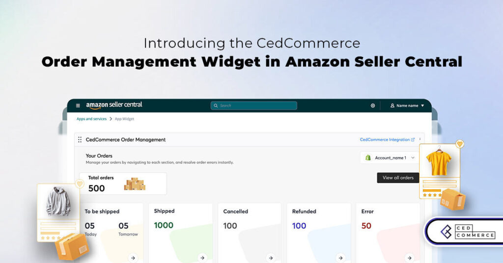
Order Management Redefined: A Centralized Solution for Amazon Sellers
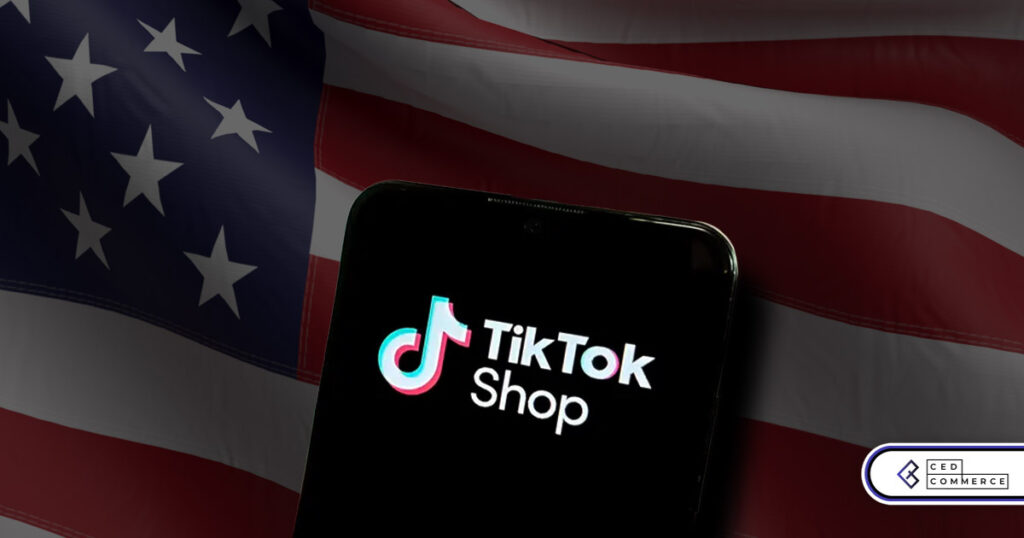
Maximizing TikTok Shop’s Regional Compatibility for US, UK, and EU Markets
Understanding U.S. Tariffs in 2025: What Sellers Need to Know and Do
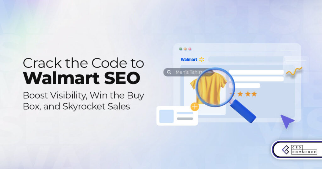
Walmart’s Search Algorithm Decoded: How to Rank Higher & Sell More
TikTok Gets a 75-Day Reprieve in the USA as Trump Signals Hope for a Deal

TikTok Shop Introduces Category-Based Benchmarks for Product Listings – What Sellers Need to Know
Amazon FBA vs. FBM: Which Fulfillment Method Is Right for You?
Amazon Launches Another AI Tool for Sellers: AI Generated Product Enrichment
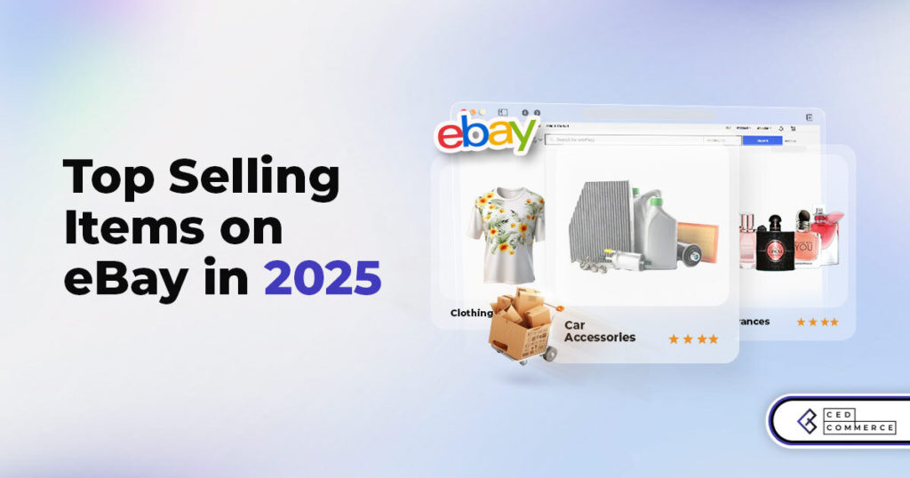
Top 10 Selling Items on eBay in 2025
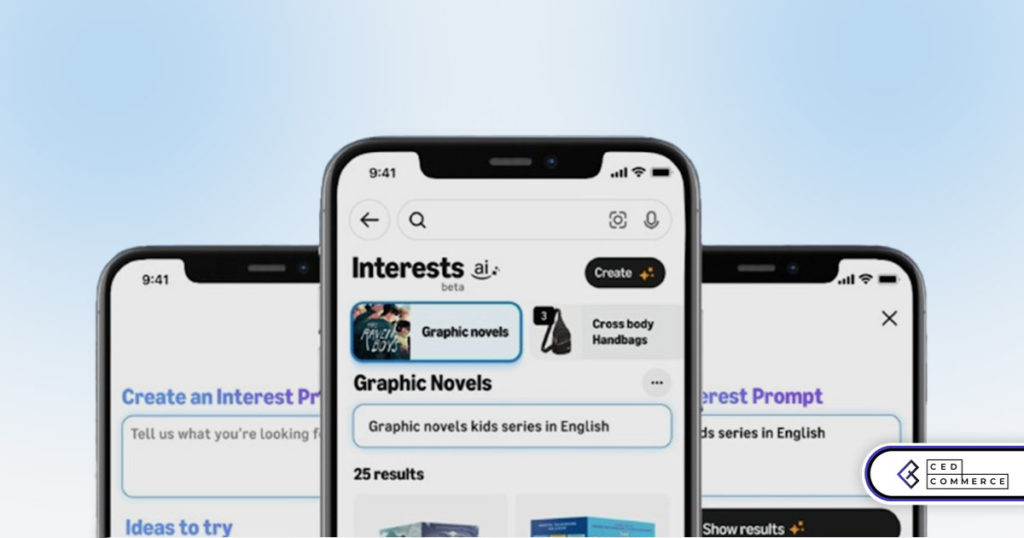
Amazon launches AI Powered ‘Interests’ Feature to Improve Shopping Experience

Is TikTok Staying in the US? The State of TikTok Ban
Best Buy coming back to the US, Marketplace Relaunch and New Opportunities in Store!
Miravia PrestaShop Connector: Built for Smart Sellers
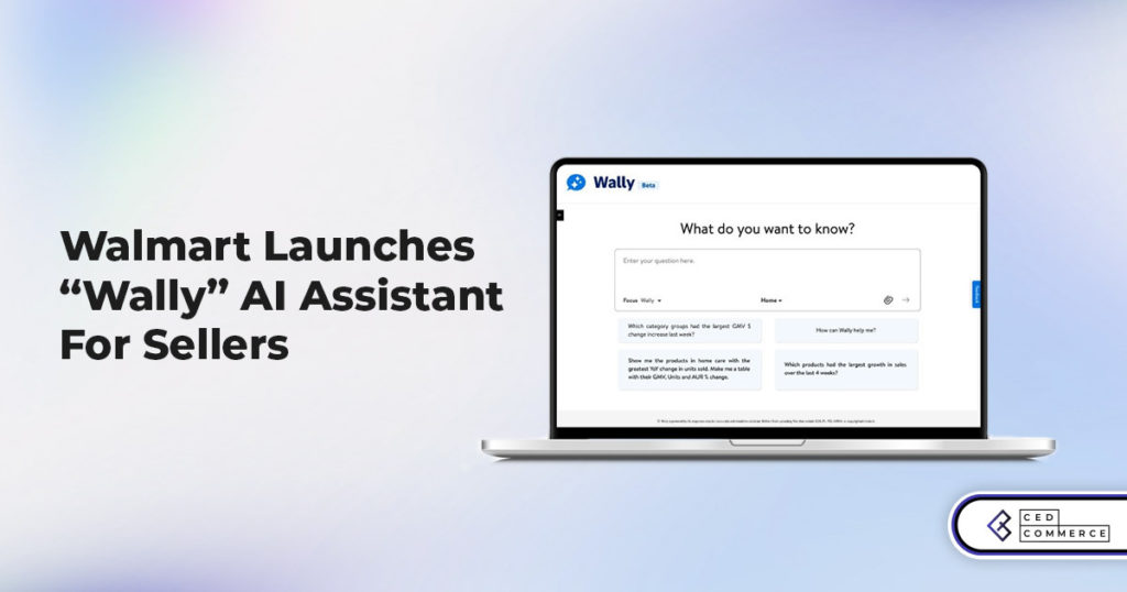
Walmart Launches “Wally”, AI Assistant For Merchants
TikTok Shop to Start Business in Germany, France, and Italy
TikTok Shop Surges as Americans Spend $700 Annually, Defying Regulatory Pressures
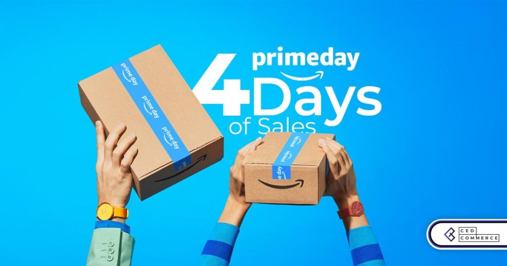
Amazon’s Longest Prime Day Ever: What You Need to Know
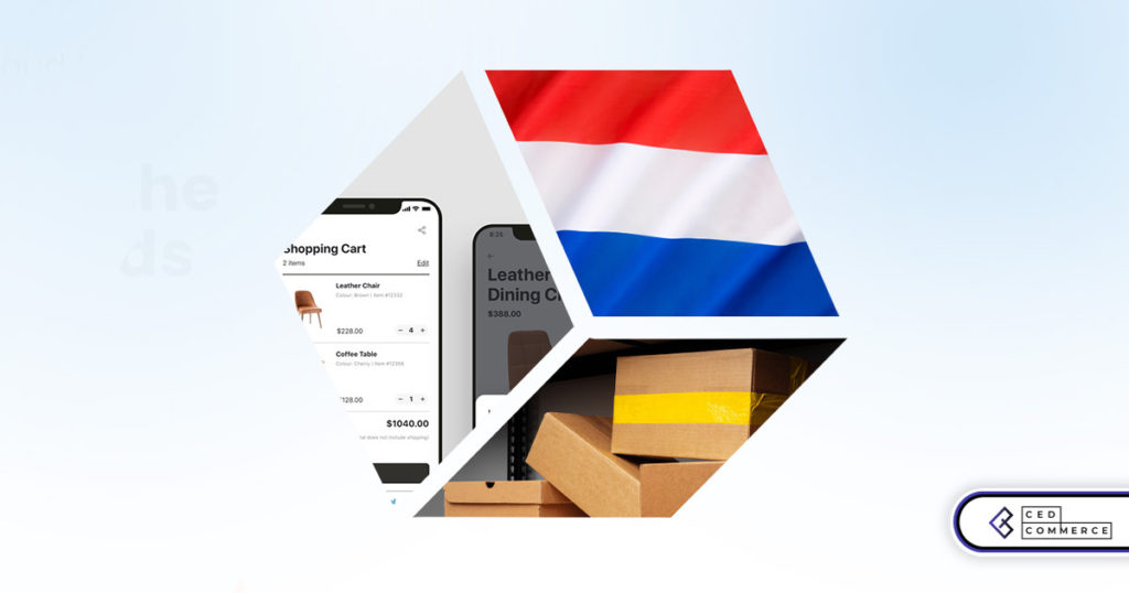
eCommerce Growth in the Netherlands: A 5% Surge in 2024 with Bright Prospects Ahead
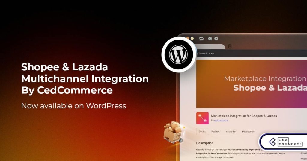
CedCommerce Launches Shopee & Lazada Integration for WooCommerce on WordPress.com