Etsy expands Purchase Protection: What sellers need to fix before 7 May
Reading Time: 3 minutes Etsy is updating its Purchase Protection programme from 7 May, and…
WooCommerce dropshipping is a more profitable business venture and with shallow risk compared to WooCommerce online stores. After all, no need to worry about inventory and shipping.
But, considering the unprecedented level of competition in the dropshipping arena, it is wise to empower for your Woocommerce dropshipping store with dropshipping best practices.
WooCommerce is free of cost and flexible enough to incorporate extra functionality in the store using 56000 plus free plugins. It has simple configurations that are helpful to list your products in a few steps. The best part about WooCommerce is not a steep learning curve. Hence, it can be used by anyone.
Skip free hosting always. Free stuff comes with unwanted situations. Once you opt for it, you have to place an ad (by the person offering a tiny part of his server to make quick bucks) on your WooCommerce dropshipping store. It is nothing more than a mess that you will regret in the long run. Therefore, focus on the below parameters.
Cheap hosting plans mean a good amount of work (other than server optimization) will be your responsibility. Cloud-based hosting can dynamically adapt to the demand of the store. Hence, the perfect solution for the sudden spike in traffic will save the site from freezing or going down, and the customer shopping experience will be smooth.
The Pro Tip: The cost of a domain is inversely proportional to the quality of customer support offered in most cases. Hence, don’t be on the lookout for the cheapest hosting solution.
The perfect domain name has a crucial role in ensuring an excellent first impression, affects SEO, and helps to portray the brand. Here’s what enables you to choose the best domain name.
The Theme of your dropshipping stores separates it from the crowd. Above all, it lends a unique visual identity that helps to perfectly present the purpose of the store within the first few seconds.
Let’s see what attributes will make your theme work in favor of your business.
Responsiveness is undoubtedly a must-have attribute. It will correctly map the layout of your store across devices with different screen sizes. Hence, smooth customer experience despite user switching between other devices.
Google prefers mobile-friendly websites over any other and places them at the top in SERPs.
Simple navigation will allow visitors to browse the entire website in the least amount of time. Hence, choosing a theme wherein navigation is prominent enough to be located by first-time visitors.
Degree of customization is another important consideration for choosing a theme. It empowers you to modify the look and feel of the website by enhancing the layout. Therefore, making it easy for your brand to stand out.
The theme that can be customized to look relevant to your business objectives resonates very well with your audience.
The Pro Tip: Cross-border compatibility and mobile responsiveness are two super important factors that can’t be ignored under any scenario. They collectively ensure your website successfully reaches the maximum possible users.
With the overwhelming number of choices, advice, and recommendations, it seems pretty challenging to decide what will be the best fit for your Woocommerce store homepage. .
A solid first impression is necessary for customers to spend more time on the homepage of your WooCommerce dropshipping store. More time spent on the home page results in customers learning more about the products and store. Let’s focus on what should be done to make customers familiar with your business positively.
There must be a brief introduction about business (avoid jargon) followed by how you are committed to delivering a better customer experience than competitors. Here you need to explain what makes your product stand out on parameters that are decisive for purchase.
Keep the color schemes that tend to be easy on the eyes. Above all, 85% of visitors consider it important to determine product purchase.
Image credit: neilpatel
Do you Know: Changing the color of CTA has the potential to fetch better results in terms of conversion rate.
The Pro Tip: Your home page must answer what do you sell? And why should customers buy it from you?
The primary purpose of the homepage must be to create a branded website.
The product page is crucial to remain ahead of the game. Your customer eventually decides to purchase your product while browsing this page. It is possible when your product page can effectively convey product value. Hence, it is necessary to ensure product page flow must be in a manner that customers find convenient to explore.
image credit: onespace.com
Customers visit the about us page of an online store to know more about business and brand. Therefore, you have an opportunity to help them build confidence in the company and your commitment to delivering nothing but the best.
It will be highly beneficial to boost customer understanding by adding below
This page aims to assure customers about their complaints and feedback will be listened to by the right people.
Therefore, you need to adhere to the below best practices for the contact us page of the WooCommerce dropshipping store.
The purpose of the FAQ page is to provide sufficient and relevant information. Therefore, customers need not contact the support and increase their burden for trivial issues.
As a result, FAQ pages help save time for your customer support which can better use to entertain serious and important queries.
Too many questions on a FAQ page can better be represented by clubbing them under sub-categories like return, product, order, shipping, pre-order and more.
The answers should be crafted to demonstrate your in-depth understanding but avoid giving too much information that is just not required.
As you expand business and reach out to new customers means new queries will come your way. It means loads of questions on your page, but don’t let it consume customer time to find what they need instead, implement an in-built search option on the FAQ page.
The Pro Tip: Every web page of your store must be mobile-friendly and load at a lightning-fast speed. The two necessary attributes enable a delightful shopping journey for customers.
Establishing a strong presence in a competitive environment is crucial for the survival of a dropshipping business. Therefore you need to work upon theme selection to the FAQs page and everything in between. Above mentioned tips and best practices will ensure your dropshipping journey is smooth and successful one.
Reading Time: 3 minutes Etsy is updating its Purchase Protection programme from 7 May, and…

Reading Time: 2 minutes Walmart is doubling down on creator-driven social commerce, turning influencer content…

Reading Time: 2 minutes In a major follow-up to our earlier coverage — “Amazon Confirms:…
Reading Time: 12 minutes From Etsy policy changes, such as fees and payments, to creativity…

Reading Time: 1 minuteDigital Commerce 360 reports that eCommerce accounted for 25% of total retail…
Reading Time: 1 minuteA coalition of 23 WTO member countries, including the United States, Britain,…

Reading Time: 2 minutes Amazon has announced a 3.5% surcharge for sellers using its fulfilment network…

Reading Time: 2 minutes Amazon has officially expanded its free, box-free, label-free returns network by…

Reading Time: 2 minutes Walmart is bringing Sparky, its proprietary shopping assistant, into ChatGPT, marking…

Reading Time: 2 minutes Visa has rolled out six AI-powered dispute resolution tools aimed at…

Reading Time: 3 minutes On March 26, 2026, the European Parliament and the Council reached…

Reading Time: 4 minutes Kanzen Skincare and six other brands are preparing for what is…
Reading Time: 5 minutes When a seller expands to a new Walmart market, the first…
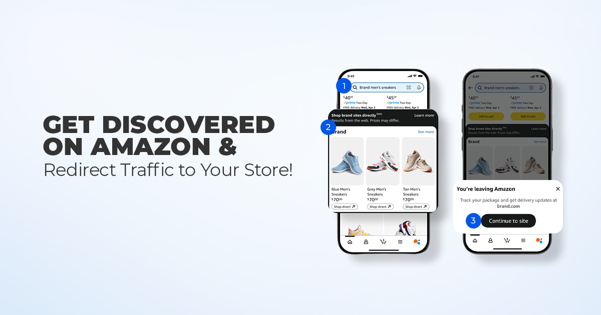
Reading Time: 11 minutes What if reaching hundreds of millions of Amazon customers didn’t mean…

Reading Time: 2 minutes Alibaba’s latest update shows that AI is becoming a much bigger…

Reading Time: 2 minutes A new industry study shows that agentic commerce is moving from…

Reading Time: 2 minutes Amazon has introduced new 1-hour and 3-hour delivery options for customers…
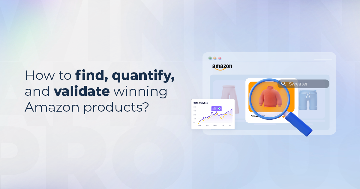
Reading Time: 16 minutes How to find, quantify, and validate winning Amazon products? Amazon product…

Reading Time: 2 minutes Amazon is rolling out a significant update that will directly impact…

Reading Time: 3 minutes Ulta Beauty is preparing to launch a curated storefront on TikTok…