
EU €3 Customs Duty on Small Parcels Starts Today: What Cross-Border Sellers Need to Know
Reading Time: 2 minutes Intro Summary The European Union’s new €3 customs duty on low-value…
Running short of time? Get PDF of the blog in your mail.
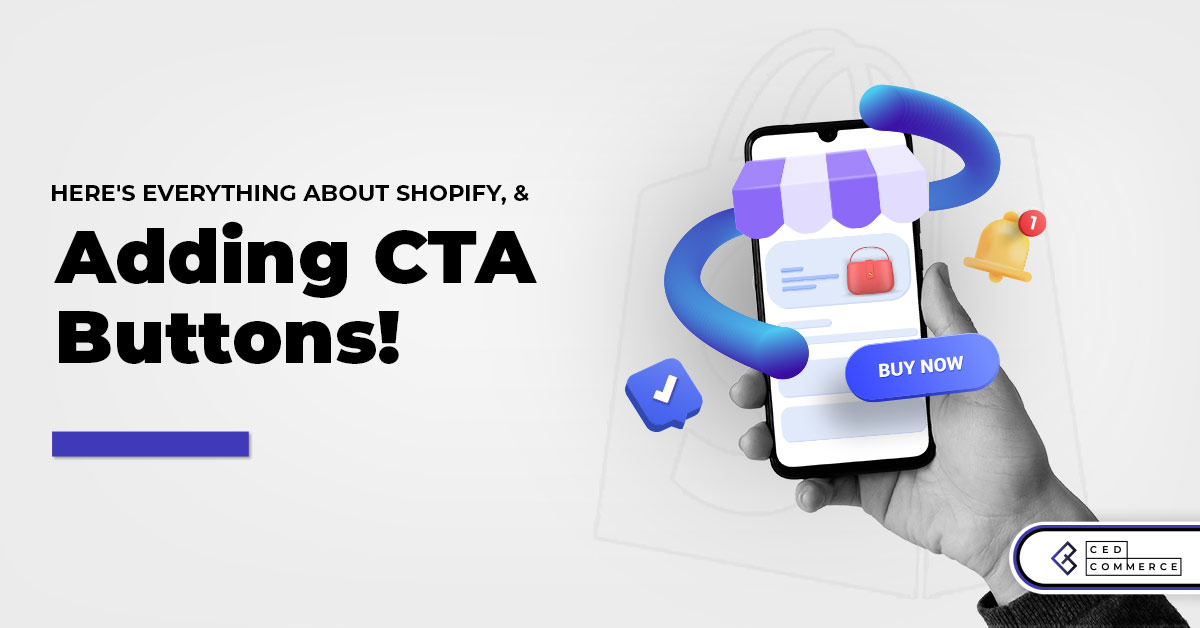
Like words in a novel tickle the reader’s emotions, CTA buttons motivate visitors to take action. The nucleus of your Shopify store design should be to convert visitors into customers through the effective CTA buttons. As a result, you should give due importance to these actionable buttons while designing your Shopify store. But how do we define effective and actionable buttons? Where to place them in your Shopify store? Questions are many, and answers to such questions are fewer. This article is a back-to-front approach to getting you acquainted with call-to-action buttons and an ultra-fine placement strategy. You can also hire a Shopify developer to ensure their correct placement and get your visitors clicking. After all, an expert opinion always comes in handy in this dynamic world of eCommerce.
A call to action (CTA) is a prompt that nudges a user to act. These buttons take visitors into your sales funnel and convert them into potential customers. If you are casual with their placement, your store visitors might find it difficult to figure out what to do next?
Are CTA buttons all about “place your order” & “buy now”? No. Here are some examples you might see in an online store –
Placing CTA buttons in a Shopify store is less of a how-to and more of art & science mixed. You can hire a Shopify developer and build actionable buttons to amplify your funnel.
What is a good CTA button? The answer to this question is hidden in the aesthetics of store development. The color of the buttons and the words you choose play a key role. Once you catch the art and science of CTA buttons, place them in just a few clicks.
Actionable words you choose tell visitors what will happen if they click the button. The difference between a button and an effective CTA button is the choice of words. So make sure that the words you should fulfill the following criteria –


There is no one way to choose the right words, but your final copy should solve the purpose in a conveniently energetic tone. Your homepage should entice visitors to view more offers, signup, and the likewise. Keeping product pages as the final destination, you need to build a passage for the visitors who travel from the homepage and reach the product page to hit that place an order button.
A careful blend of colors highlighting the right words amplifies CTA buttons. Changing the color often impacts positively on your store’s conversion rate. Everything boils down to how much you A/B test your store’s design and call-to-action buttons.
Choosing a color palette will bring uniformity. Blending your storefront with color psychology is the key. Blue is known for trust and dependability, whereas green is the color of balance and harmony.

Let’s say you’re managing an apparel store with Shopify. Instead of choosing a black color, you can pick blue or orange. Whereas if you sell luxe merchandise, a white storefront backed up with sleek black CTA buttons would be apt.
The more you play with the buttons, design, and layout, the easier it will be. You can hire a Shopify store developer to revamp, streamline, strengthen and speed up your store.
Now comes the exciting part. Where should you place your CTA buttons to get the visitors clicking? The answer is hidden in the visual hierarchy. Shoppers usually have a Z pattern. Knowing this, you can place CTA buttons in the top corners or bottom lines.
The Z pattern is the model where shoppers scan pages with less scrolling. But Z patterns are not the only ones. Here comes the F. No, not the word, the visual model where users scan, read, and pick one product out of the many. When you hire a Shopify store developer, they run rigorous tests to ensure that all the variables, metafields, elements, and buttons vibe together. Why don’t you consult our team of store developers for your quarterly A/B testing?
Your homepage is about quirky, catchy, concise copy, imagery, illustrations, navigation, and action. Navigational links to the header menu are actionable buttons, provided they are catchy and visible.
Here is an example of a neat homepage design of an apparel store. Following the Z pattern, the store has all the necessary links and navigational buttons to the top and bottom of the page, leaving the middle area for graphics and imagery. Having a sticky header streamlines your visitor’s navigational journey.

Below is another example of a Shopify store dealing with superior golf accessories. Scrolling down the store will not hide the header menu. This makes it easy for visitors to hop on to their shippable categories. They have an actionable button in the middle of the page – not too big, not too small. Remember, to attain mastery in the art and science of CTA buttons; you must be open to experiments and layout testings.

Product pages are the nucleus of a product itself. These pages should be minimalistic, and 90% of their space should be occupied by product images, additional information, social proof, buttons, and likewise recommendations.
Put yourself in the shoes of a shopper and ask – what would you like to see on the product pages? Buttons, more buttons? Or a balance of everything with due attention to what you’re going to buy?
Below are two examples of a single-product Shopify store offering natural pain relief spray and a store inspired by the coffee culture. Knowing that a typical shopping would like to watch and read simultaneously, here’s how they have placed CTA buttons. Both the Shopify stores have used the F pattern.


Netflix shop breaks the monotony of the F patterns with its impactful design. Netflix Shop is built with Shopify OS 2.0 framework, which offers more flexibility and freedom to customize the web pages. Watch how wisely they have sandwiched actionable buttons and product details between product imagery.

How do you think these Shopify stores would have found a spot for their CTA buttons? Was it in one go? Not. After split testings, they figure out the aesthetics of an impactful Shopify store.
Placing actionable CTA buttons in your Shopify store is the art you master only when you practice it. While you come up with a great store design, remember that excess of anything is bad, especially in the case of call-to-action buttons. If your Shopify store’s homepage has more than 3 CTA buttons, then the visitors might not know where to go exactly.
There should be a decent gap between your CTA buttons. Utilize these gaps with banners, product photography, videos, or user-generated content. Your homepage should have at least 3 CTA buttons, but as you move to product pages, the number cuts down to 2 or 1.
Just make sure that no element of your Shopify store becomes a pain to visitors.
Getting visitors to click can be daunting or as interesting as art. The art is all about knowing your product and customers. Then it is all about placing the elements throughout your Shopify store that frames a customer’s journey.
Perfection is not a formula. Perfection is consistency and openness to change. With Shopify, you can experience this openness to change most conveniently. With the advent of Shopify 2.0, you can customize your theme by dragging and dropping the elements from the theme editor. If you truly want to unleash your store, hire a Shopify store developer to strengthen your visibility, aesthetics, and sales funnel.
Reading Time: 2 minutes Intro Summary The European Union’s new €3 customs duty on low-value…
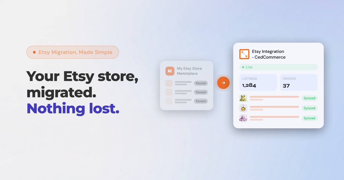
Reading Time: 8 minutes If you’ve been running your Etsy store through Shopify Marketplace Connect,…
Reading Time: 2 minutes In a major follow-up to our earlier coverage — “Amazon Confirms:…
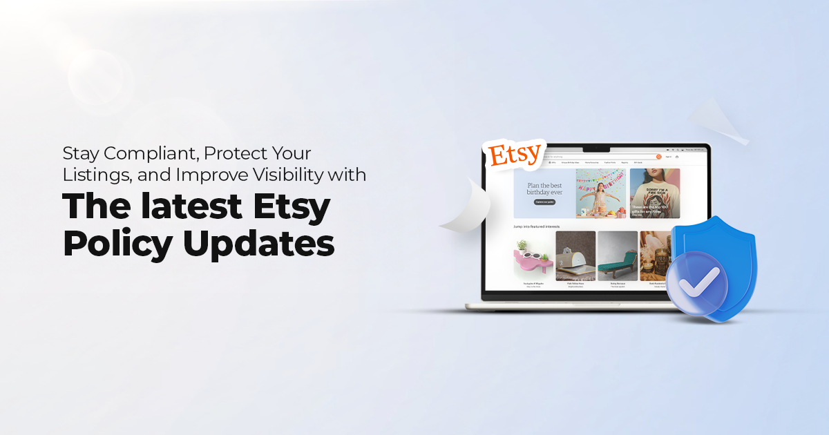
Reading Time: 12 minutes From Etsy policy changes, such as fees and payments, to creativity…

Reading Time: 1 minuteDigital Commerce 360 reports that eCommerce accounted for 25% of total retail…
Reading Time: 1 minuteA coalition of 23 WTO member countries, including the United States, Britain,…
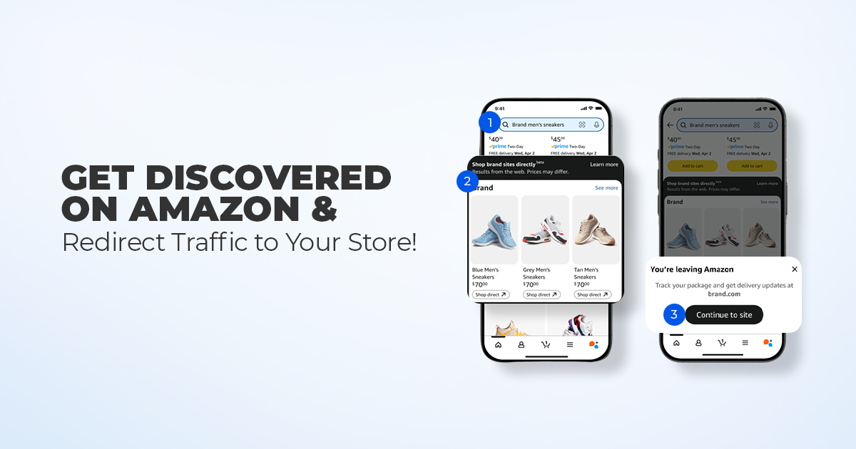
Reading Time: 11 minutes What if reaching hundreds of millions of Amazon customers didn’t mean…
Reading Time: 2 minutes Alibaba’s latest update shows that AI is becoming a much bigger…

Reading Time: 2 minutes A new industry study shows that agentic commerce is moving from…
Reading Time: 4 minutes TikTok Shop has officially launched its first-ever Fine Art category, marking…