
Looking for a Shopify Etsy Integration? Switch to CedCommerce for a Solution Built for Shopify
Reading Time: 8 minutes If you’ve been running your Etsy store through Shopify Marketplace Connect,…
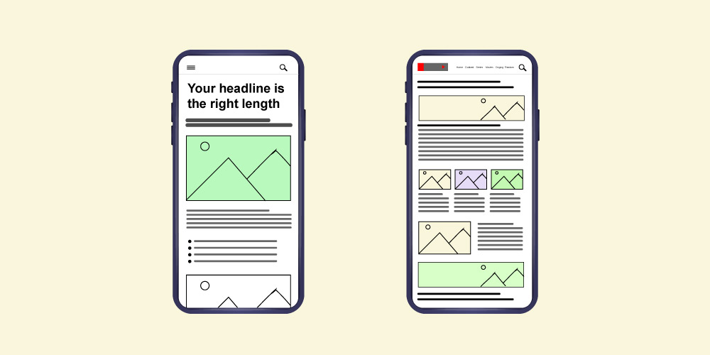
![How To Create Mobile-Friendly Content [7 Actionable Strategies]](https://cedcommerce.com/blog/wp-content/uploads/2021/03/7-actionable-tips-for-creating-mobile-friendly-content-1.jpg)
Running short of time? Get PDF of the blog in your mail.
Do you know there are 5.20 billion mobile device users in the world? And due to COVID-19 pandemic effect, Mobile device users have become even more active. Think if you can hit just 0.1% users, what impact will it create. Just think about it! And mobile-friendly content is the tool that you can leverage to reach this vast set of audience.
Writing mobile-friendly content means not losing the power of content even by minimal writing. Now, when we are talking about how to create mobile-friendly content? One thing that strikes directly is the small screen of the mobile device. So, what can be the best way for a mobile-friendly view?
The strategy is simple. You don’t need to put in extra effort for mobile-friendly content writing. Just go with the flow that you generally do, with simple changes in content strategies. And these strategies will help you convert to mobile-friendly content writing.
Take this as an opportunity to hit the graphs high for yourself and move ahead of your competitors, with the simple tips covered in this article. You can make a huge difference not only for your mobile device users but also for desktop users.
But before starting with the key points. Let me clear you with the term mobile-friendly.
Mobile-friendly means that your website efficiently works on a mobile device like a phone or tablet and is shrunk to adjust on the smartphone’s small screen.
Ok, now that you know what mobile-friendly means and can connect to why the focus is on creating mobile-friendly content. So, we can get started with the tips for writing mobile-friendly content. With these tips, you can make a huge difference not only for your mobile device users but also for desktop users.
The first element that you need to focus on is the reading pattern. Reading patterns work differently on mobile devices when compared to desktop users. Desktop users follow the golden triangle study pattern or the F-shaped study pattern. In both cases, users focus on the upper top-left section of the screen. But, this is not the case with mobile device readers. Their gaze is evenly distributed.
This means that to be mobile-friendly, you need to optimize the entire content for your readers. So, no reading pattern needs to be followed.
The second element you need to look at is the breakdown of content for small screen mobile devices. Since there’s no particular pattern that is followed by mobile users, it becomes more critical to chunk the content.
For easy reading, create content that is evenly distributed with divisions and subdivisions of all the information. The structure of your content has to be optimised for a mobile-friendly view. To optimise your structure for mobile devices. Keep your content snackable because people love short and snappy content.
Short and snappy content means providing all the related content in short views. In practice, chunking is about creating meaningful, visually distinct content units that make sense in the context of the larger whole. said, Nielsen So, to chunk your content structure for mobile-friendly page and desktop reading, you can prefer using:
Another important point that needs to be highlighted is creating short paragraphs for mobile-friendly sites. After the content is cut short and minimised for the mobile devices, adjust content in short sections. Each paragraph should target a single point. Moreover, short paragraphs are easy to focus on main issues eliminating long walls of text.
You can work out with the below-listed points.
Titles are an interesting feature that you can’t miss when producing mobile-friendly content. Titles will get you the highest click-throughs. So, remember to make your title attractive by using your keywords in the title.
Keep your keywords close to the title for search engine optimisation. Moreover, remember that someone is constantly searching for a keyword when they are on Google.
To optimise your title for a mobile-friendly view. Toss around the following points, and then you can start.
The above points will not let your title get truncated on mobile devices. So remember to work out with this formula for a short title of 6 words or 37 characters.
Pro Tip: Sticking to short titles means extracting most from the headlines.
Please avoid the use of complex words for your readers because they make your writing difficult to understand. Make your content easy for mobile-friendly devices. Remember to focus on the simple language that builds relationships with your readers. Here are some words to simplify your writing:
| Complex Words | Simple Words |
| Commence | Start |
| Numerous | Many |
| Sufficient | Enough |
| Enumerate | List |
| Converse | Talk |
| Assistance | Help |
| Terminate | End |
| Utilize | Use |
| Interrogate | Ask |
Images are an excellent piece of visual content. Therefore, your content can be made more appealing with the help of pictures. So, to make your content mobile-friendly, back it with images.
Images break your content for easy reading to mobile device users. The best way to make your pictures mobile-friendly is by optimizing your images. Make use of responsive and compressing images of the right size for mobile devices.
Take away point: Mobile device users look at images more than they look at the text.
The above statement reflects the importance of images provided by mobile devices, but, at the same time, it provides options for content marketers to use this very feature for their benefit.
Instagram has been growing up so fast due to this very reason. It highlights images rather than the text. Yet, it can’t be stopped. The same goes with Snapchat.
What comes out of these two popular examples is that one should also focus on Images. If not only images. I know, because let us be honest, we are not a camera organization with different filters. We are here for some real business. So, this is something we can consider when working for mobile-friendly content.
All admire simplicity, and most writers focus on this. So, when you create content, try using simple words and replace them with wordy phrases. Wordy phrases are not so good because they often engender long and take more time for reading.
This makes the reading experience a drudge. So, you can work on this simple writing tip to make your content mobile-friendly.
Here is a list of some of the most commonly used wordy phrases and their substitutes:
These are some of the wordy phrases that you can avoid using when working on mobile-friendly content. Moreover, you can check the list of 50 most commonly used wordy phrases and their alternatives. Try working on it.
I hope now you can rock the mobile of your users such that the user experience remains unaltered. Therefore reach a wider audience and rank organically on the search engine. And it is also a known fact that Google favors mobile-friendly content and websites. You can ask more in the comment section.

Reading Time: 8 minutes If you’ve been running your Etsy store through Shopify Marketplace Connect,…

Reading Time: 2 minutes In a major follow-up to our earlier coverage — “Amazon Confirms:…

Reading Time: 12 minutes From Etsy policy changes, such as fees and payments, to creativity…

Reading Time: 1 minuteDigital Commerce 360 reports that eCommerce accounted for 25% of total retail…

Reading Time: 1 minuteA coalition of 23 WTO member countries, including the United States, Britain,…

Reading Time: 11 minutes What if reaching hundreds of millions of Amazon customers didn’t mean…
Reading Time: 2 minutes Alibaba’s latest update shows that AI is becoming a much bigger…

Reading Time: 2 minutes A new industry study shows that agentic commerce is moving from…

Reading Time: 4 minutes TikTok Shop has officially launched its first-ever Fine Art category, marking…
Reading Time: 3 minutes A major shift is emerging in how Gen Z discovers and…