EU Custom Code Reform Advances on March 26: What Cross-Border Sellers Should Know
Reading Time: 3 minutes On March 26, 2026, the European Parliament and the Council reached…
It’s good to stick to your website’s unique theme, but you can have fun by welcoming your visitors with a Spooky spirit as the Scary-good time of the year – Halloween is around. It’s almost here! With just a few days away, you must be already hearing and seeing things like Jack-o-lanterns, pumpkin carving, witches, scarecrows, black cats, and other creepy creatures around. Currently, the Squid Game costume is the newest and the most talked-about Halloween costume trend. Now! With all the creepy-spookiness around, here’s a question for you – Is your BigCommerce store ready for this festival? If yes, then it’s good, but if not? Well! It’s never too late to look up the last-minute BigCommerce Store customization ideas for Halloween.
Let’s unlock some of the least-known Halloween store customization ideas to give a spine-chilling experience to your visitors. These hauntingly gruesome Halloween website ideas are practical, super easy, and quick to implement at the last minute.
Before jumping to the strategies mentioned above, let’s do a quick check on why you need a Halloween-themed web design for your online store.
Halloween is more of a treat than a trick for eCommerce businesses, as customers are likely to spend more around this time. In the USA alone, a report says the total consumer expenditure is expected to increase to $10.1 billion in 2021 compared to 2020, which was about $8 billion. And the average expected spending for Halloween in 2021 will be $102.74. This year almost two-third, i.e., 65% of the consumers, are planning to celebrate Halloween.
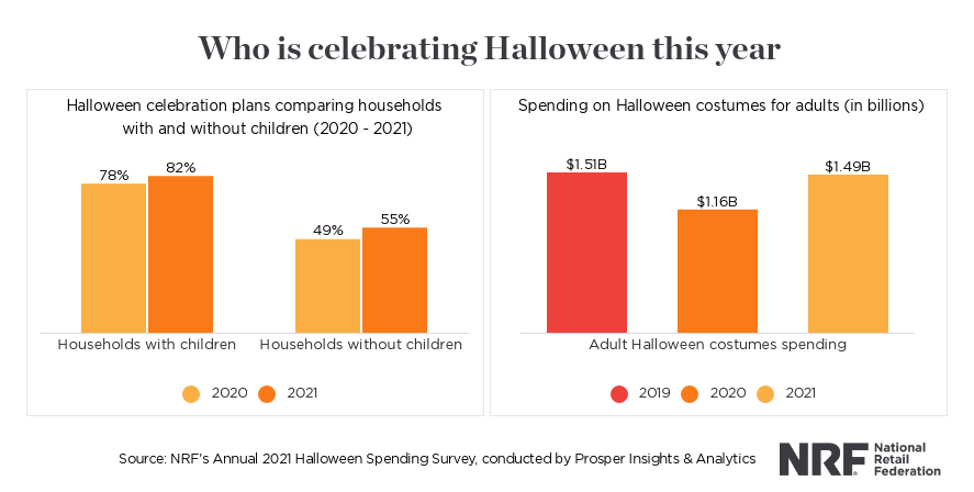
Now with such a high expected customer expenditure, as an eCommerce store owner, you must not miss this opportunity and should make full use of it with creepy, scary strategies to appeal and engage visitors more than ever.
Besides, the seasonal changes in the website design hold many advantages:
Now that you know why your store needs a Halloweeny look, let’s jump back to the topic of how to customize your BigCommerce store for the same.
Go for a ‘Haunted Homepage’ combining a silhouette section divider, a related raining background video, a spooky logo, and scary taglines that Wooo your customers and are impossible to ignore. Include creepy creatures like the evil Jack-o-lanterns, life-like scarecrows, and other creatures on the banner to create an eerie atmosphere. Also, add “Happy Halloween” labels or badges throughout the homepage.
You can add flying objects such as ghosts, pumpkins, and bats nicely animated for the Halloween effect. Also, give your brand logo a creepy twist with nerve-racking spider webs and spooky fonts to give it a more Halloween feel.
Adding a skull divider to the menu section is yet another most effective yet quick BigCommerce store customization tactic to choose for Halloween. Add extra focus on line breaks with spiderwebs, cats, bats, and other Halloween Web design elements for inspiration to add that spooky feel to the menu section of your store. Surely, it will give a whole new look to the section.
Besides the divider, you can even include hand-drawn Halloween icons like a Zombie, ghost, RIP stone, laughing pumpkin, and so on. When opting for the font styles of the menu bar, make sure you go for the most creepy one.
Some of the most used Free Halloween fonts for BigCommerce store owners to use-
BigCommerce merchants seeking quick assistance and service to customize or upgrade websites can connect CedCommerce Design Experts and get things done in no time.
Create a Killer Services section by using Halloween icons, color combo in the background, and fonts. Now, this will add a proper Holiday spirit and will spice up your services section with creepiness.
Picking a mix & match or single shade theme of traditional Halloween colors such as orange, black, and grey is one of the simplest yet most effective last-minute Halloween web design trends to choose.
Here’s a pro tip – Opt for the Squid game color theme, i.e., red and green color, as it is trending and make your Service page look more happening and spooky.
Give your Contact US Form a festive touch by adding small Halloween elements like flying bats, witches, zombies, or laughing skulls. Optimizing your website’s contact form/page is perhaps one of the simplest and quickest Halloween Website ideas to make your visitors feel the vibe.
Here’s a quick trick to create a purgatory Contact Us page or form – Use a pumpkin mask with fire sizzling on the background. First, set fire video in the background and then put a pumpkin mask as an image overlay to get this trick.
Know-how CedCommerce helps you to stay ahead of your competitors with its high-end store customization and website development services.
Bang with BOOOO and scare your visitors with a Bloody Dreadful Call To Action to show off your store’s seasonal offers. Combining the traditional Halloween color, fonts, and divider creates an enigmatic, creepy CTA with Jaw-dropping sales deals or offers.
When talking about Halloween fonts, many unusual fonts are freely available, and you can customize your Bigcommerce store to give that scariest feel. You can even opt for the Squid game timer trick by offering your visitors a few seconds or a minute to either click on the CTA or lose the deal. This will create a sense of urgency in your visitors to click on the CTA within the time limit.
Pro tip – Set drop shape dividers to give your CTA that extra-bloody Halloween feel.
This Halloween, give your visitors a mind-boggling experience. Opt for these 5 Halloween web design trends to transform your BigCommerce store into a thrilling creation.
And if you are finding any difficulty in setting up any of the afore-mentioned BigCommerce store customization strategies? Then don’t worry – We have your back. Our highly skilled experts are here to listen to your queries 24/7. And, get your store customized as per your need in no time.
So, what are you waiting for? Hurry Up!

Reading Time: 3 minutes On March 26, 2026, the European Parliament and the Council reached…
Reading Time: 4 minutes Kanzen Skincare and six other brands are preparing for what is…
Reading Time: 5 minutes When a seller expands to a new Walmart market, the first…
Reading Time: 10 minutes What if reaching hundreds of millions of Amazon customers didn’t mean…

Reading Time: 2 minutes Alibaba’s latest update shows that AI is becoming a much bigger…

Reading Time: 2 minutes A new industry study shows that agentic commerce is moving from…

Reading Time: 2 minutes Amazon has introduced new 1-hour and 3-hour delivery options for customers…
Reading Time: 16 minutes How to find, quantify, and validate winning Amazon products? Amazon product…

Reading Time: 2 minutes Amazon is rolling out a significant update that will directly impact…

Reading Time: 3 minutes Ulta Beauty is preparing to launch a curated storefront on TikTok…

Reading Time: 2 minutes Until now, falling below the 90% OTDR (On-time Delivery Requirement) could…

Reading Time: 5 minutes Amazon has formally expanded its Multi-Channel Fulfillment (MCF) operations in Europe…

Reading Time: 4 minutes Amazon has announced that Sponsored Products prompts and Sponsored Brands prompts…

Reading Time: 4 minutes Amazon has expanded access to its healthcare-focused AI assistant, Health AI,…

Reading Time: 4 minutes Amazon has officially launched its Spring Deal Days shopping event, offering…
Reading Time: 4 minutes eBay UK has announced a new partnership with global embedded finance…

Reading Time: 4 minutes TikTok Shop has officially launched its first-ever Fine Art category, marking…

Reading Time: 2 minutes eBay has temporarily paused international sales from the United States to…

Reading Time: 3 minutes Walmart Marketplace has expanded its Review Accelerator program with a new…

Reading Time: 3 minutes A significant policy change is coming to Amazon Wish Lists that…