
EU €3 Customs Duty on Small Parcels Starts Today: What Cross-Border Sellers Need to Know
Reading Time: 2 minutes Intro Summary The European Union’s new €3 customs duty on low-value…
Running short of time? Get PDF of the blog in your mail.
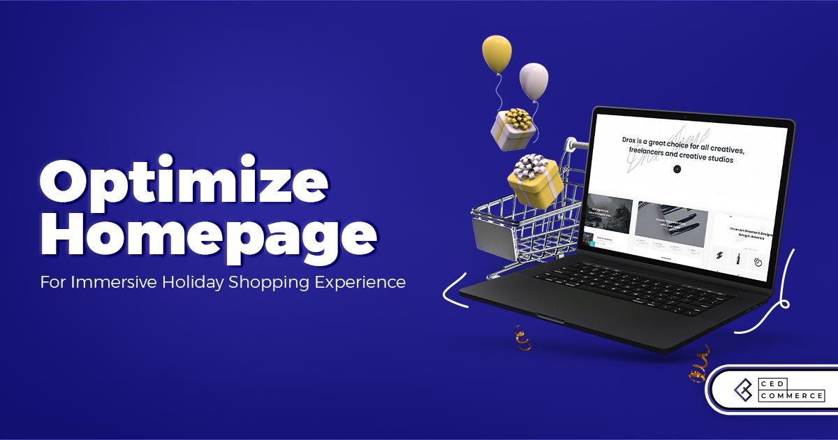
You are desirous of a killer homepage for ecommerce. Think as customers dive deep into their mindset while browsing an ecommerce website. It reveals loads of nitty-gritty facts on homepage design and other related insights.
As a result, you will not be guessing but knowing what will get customer attention hooked on your site. Now that’s something you will not want to miss out on. With that said, here are the best practices that will help you keep the momentum high with stellar home page design.
All you have is half a second to display a killer first impression and let the customer not think of switching to the other site.
With that said, it is necessary to know its anatomy and tune your efforts accordingly to benefit your business.
Usually, the majority of visitors first meet your business on your homepage. An impressive homepage design that builds trust and enables effortless navigation is a prerequisite to excellent homepage design.
Adhering to the below best practices will make it welcoming and cheers up the visitor.
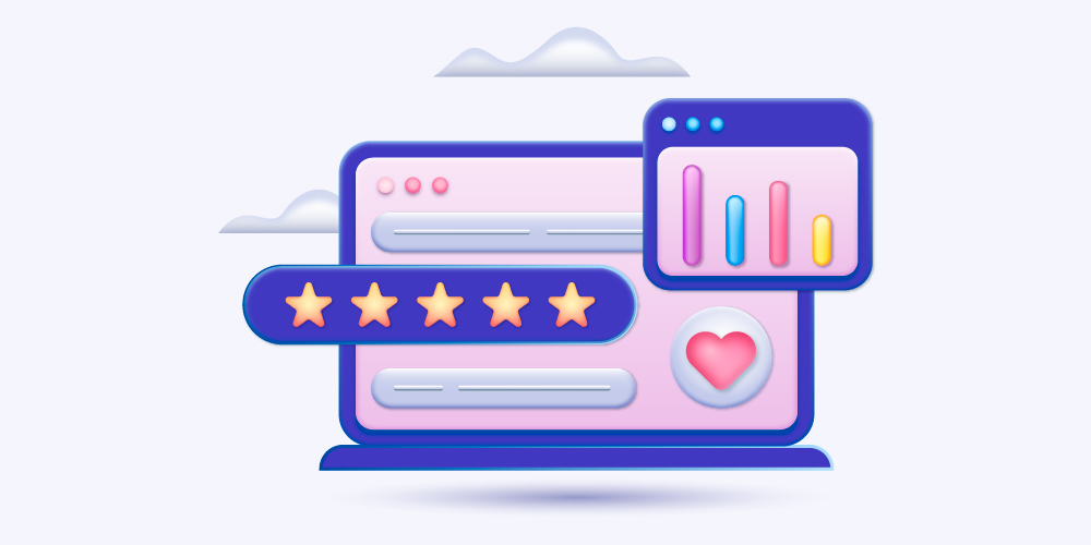
Social proof is one of the most reliable content forms. It puts an end to all sorts of uncertainties. As a result, customers have no qualms about trusting your claims.

Loyal customers can inform you about missing and annoying elements on your e-commerce store homepage with honest reviews. They are also least likely to be reluctant to answer you.
As a gesture of thank you for feedback, don’t forget to reward the customer. Leave no stone unturned to win the customer’s heart.
Now, insights gathered will be the holy grail to fix the home page design for a seamless shopping experience.
It is no secret that nobody will keep browsing when it’s hard to find the right thing. With that said, it is necessary to consider the below pointers.

I am sure you want to avoid the above scenario at all costs. Therefore,
A great story is what keeps visitors interested in knowing more and gives a reason to come back. Moreover, you will not help him browse the products but allow him to interact with your brand and learn about
With that said, the above pointers can be shared engagingly in the form of a few bite-sized videos on the homepage banner. Moreover, in a matter of few seconds, it will convey your message to your target audience.
Having designed a great homepage with everything in the proper manner is a competitive edge. But you have to update it during the holiday season.
Keep in mind that the holiday season has loads of shoppers craving gifts over anything else.

A banner that highlights all gifts you have to offer will keep visitors coming back.
Take a deep dive through website analytics to gather details on where buyers head from the homepage. Now, link these top pages in the navigation menu. An ideal homepage ensures a shopping journey gets easy.
Let the font and color on the homepage ignite the festive mood. Customers will feel elated, and it will kick in the urge to shop. Also, the right font will put zero stress on the eyes, and crucial information doesn’t go unnoticed.
Red will be perfect for making the homepage look synonymous with the holiday season. The best fonts to inculcate a feeling of festivity are as below

Image credit: simpleasthatblog
Words of appreciation by happy clients are the best source of inspiration. Let it inspire visitors, so they feel confident and are assured they are partnering with professionals.
As a result, it gets easier to convince customers, and the conversion rate increases.
Add a section (in the above half) dedicated to showcasing recent reviews/testimonials. Consider adding a few recent ones in the form of a carousel.
During the holiday season, the homepage also serves as a landing page for different ads. A customer landing on it is partially convinced but the last push to convince him is still not initiated.
Using power words will help to evoke the correct set of emotions. But what if the message is too big. And explaining in lengthy blocks of text might put off the customer.
Adding action-inducing words will ensure CTAs are appealing enough and highly likely to be clicked.
A bite-sized video will convey the message in a matter of seconds. Moreover, if a picture speaks thousands of words, a video will speak even more.

Img credit: hubspot
Less is more approach makes an integral part of an effective landing page anatomy. Too much content means very little room for white space. It will make it hard for buyers to segregate relevant information from irrelevant.
Hence, it eventually leads to confusion, and you don’t want it. So, add relevant content in the form of bullet points. The offer for the buyer needs to be mentioned above the fold to catch attention as soon he lands on the homepage.
Simplicity is always remembered, and customers have no qualms revisiting your site.


Image credit: sleeknote
Homepage might not be a checkout page, but that doesn’t diminish its importance. A homepage design that is not optimized and makes browsing a difficult task is of no use. It will do more harm than benefit.
Its important brand message is conveyed in the first few seconds. Therefore, adhering to the points mentioned above and incorporating them will boost website credibility and equip it for an immersive shopping experience during the holiday season.
Reading Time: 2 minutes Intro Summary The European Union’s new €3 customs duty on low-value…
Reading Time: 8 minutes If you’ve been running your Etsy store through Shopify Marketplace Connect,…
Reading Time: 2 minutes In a major follow-up to our earlier coverage — “Amazon Confirms:…
Reading Time: 12 minutes From Etsy policy changes, such as fees and payments, to creativity…

Reading Time: 1 minuteDigital Commerce 360 reports that eCommerce accounted for 25% of total retail…
Reading Time: 1 minuteA coalition of 23 WTO member countries, including the United States, Britain,…
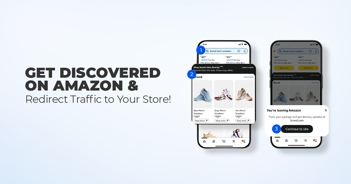
Reading Time: 11 minutes What if reaching hundreds of millions of Amazon customers didn’t mean…
Reading Time: 2 minutes Alibaba’s latest update shows that AI is becoming a much bigger…

Reading Time: 2 minutes A new industry study shows that agentic commerce is moving from…
Reading Time: 4 minutes TikTok Shop has officially launched its first-ever Fine Art category, marking…