TikTok Shop Expands Seller Logistics With Shipping and Pickup
Reading Time: 3 minutes TikTok Shop is strengthening its U.S. seller logistics stack with Upgraded…
When it comes to setting up the perfect content marketing strategy, the prominence of videos cannot be ignored! Here is what we have covered for you:
More than 75% of businesses now use video content for promotions and marketing purposes.
With more than 80% of marketers having a firm faith that videos can prove to be the best mode of developing a content marketing strategy, it is sure that the videos are the new players in the marketing game.
Survival is the need of the hour for every business. Join the webinar and catch experts from Google talking about tips & tactics on how to streamline your marketing efforts effectively that will help you to sustain your business amidst the on-going crisis.
No wonder why videos are preferred mode of content for most of the marketers present around the globe!
Increasing video watching trends (source: Statista)
Let’s have a look at these numbers:
Over the years, desktops and laptops are slowly getting evaporated with the innovations in mobile technology. In many parts of the world, eCommerce and other internet related activities are preferably done through mobile. In Southeast Asian region, more than 70% of the internet traffic comes from mobile devices, making the SEA a mobile-first economy, and this trend is being chosen by the other parts of the world too.
Are your strategies meeting your goals?
Get a free marketing audit!
That being said, let us get straight into ‘How to set up a perfect video content marketing strategy’ for your business!
Before getting into ‘How to do Video Content Marketing’, there is a strict need for research. Getting to know about what to create, for whom to create and what can be the most effective way of doing that is a must.
What’s the point of investing your time and money into the video making process when the relevant audience don’t get to see it?
So, perform in-depth research on what your brand actually reflects, what kind of products/services it has to offer, who would want to engage with your company and other important questions first.
Coming up with a Video Marketing campaign is a long term process, and planning plays a prominent role in that. Once the research part is done, and you have strong data and demographics on which you can rely upon, now is the time to plan out things like
Once done, now you can go ahead and create dynamic yet relevant video content for your audience!
Choosing the right approach for your video marketing campaign is really needed as with the right approach the desired results can be obtained.
Various types of Video Platforms are now available in the market and each of them is having their own value and customer reach.
If we talk about videos on Facebook and videos on YouTube, on both the platform, there are differences in videos.
How?
Let’s know that:
Different video platform supports different video dimensions. However, you can also use a fix dimension for all these platforms but then, your video will get cropped, due to the restricted dimensions.
You can check the various dimensions of the videos that fit fine for the social channels.
Facebook, being a social platform for sharing various kinds of stuff- text posts, images, videos, gifs, etc. The videos available on the platform appear in the news feed, just like the other posts, and so, they disappear after a day long and it becomes nearly impossible to search for the same video on Facebook again until it is re-shared.
On the other hand, YouTube is a search engine. In fact, YouTube is the second largest search engine after Google. So, here, the availability of your videos is for longer and they can also be searched easily for a re-watch or share.
It becomes necessary for a marketer to keep an exact analysis of the campaigns being performed. In such circumstances, for video marketing, the view counts too matter.
On YouTube, until the video is clicked through, the view count is not recorded, however, on Facebook, as the videos are spread through the news feeds, just by scrolling over the video, the playback starts, and if the video is watched just for 3 seconds of duration, the view is counted.
In the same way, for YouTube ads, the view is not recorded until the Ad gets played for a minimum of 30 seconds.
Determining the right type of video, keeping in mind the right kind of audience present over the social platform should be the exact strategy to gain most out of your videos!
Now, when you have an all-set marketing plan and with all the in-depth research and tools, time to start with your marketing game and start making promotions. If proper research and analysis were done, your marketing strategy will already be very effective. But, to add more power and potential to it, you can support your video marketing strategy with a few more assets.
Let’s know:
Newsletters are really an effective tool for one-on-one interaction with your customers. Whether it be a weekly or monthly newsletter, embedding your video in your newsletter can really benefit you in the course of content marketing. In research done by Forrester, including video in marketing emails lead to a surprising 200-300% increase in click-through rate.
The positive results of email marketing have been well understood by the market and this can be seen as each year, spending over email marketing is getting higher and higher!
Increasing spending over email marketing (source: Statista)
Video webinars are also a prominent way of setting your marketing strategy. Conducting webinars has been a ‘tried-and-tested’ method and is preferred by marketers. You can come up with amazing ideas and can align them in such a way that a live webinar full of information and value for your customers along with your product promotion.
Pro Tip: Include some space for an interactive Q/A session in your webinar to increase interest and engagement.
Considering the importance and prominence of videos into the marketing game in the near future, it cannot be wrong at any point to use videos at each stage of your inbound methodology!
Videos can turn out to be very effective if used through a proper strategy. There are different kinds of intents in each stage of the marketing funnel, that can easily be fulfilled via videos.
How? Have a look!
At this stage, it is all about turning strangers into visitors. Alluring the customers to check out your business and its product can be a tough and tricky task.
Well, who wants to interact with strangers?
But, here we have the exact marketing strategy using videos in this phase
And once when you have the desired leads been converted into customers, you can come up with the following:
Now when you have your customers with you, it isn’t over yet! Now is the time to provide delight to your customers for being with you! Doing this is a bit tricky, but if the right approach is taken, it will get very easy and will prove very beneficial to you and your business.
DO the following to make the best out of this stage
Also, if you have enough resources, you can start a course-structured video series session that can prove as educational content for your customers and this will also add some potential to your business.
When Facebook predicted the future back in 2014, by investing $2 Bn into the virtual reality, Oculus, the times were different and Facebook hardly was able to generate even half of the ROI.
In the same way, videos of today are having the potential to grasp a complete and firm grip over the internet in the coming years.
Often, people say that ‘The early bird gets to eat the best fruits!’
Once again, here are a few more numbers for you to understand the prominence of videos:
Here, with all the number and the tips, you are all armored to strategize your video marketing strategy.
Go and set up your tripod and shoot amazing videos out there!
All the best!
Reading Time: 3 minutes TikTok Shop is strengthening its U.S. seller logistics stack with Upgraded…
Reading Time: 2 minutes Amazon has opened a new Global Warehousing & Distribution (GWD) facility…
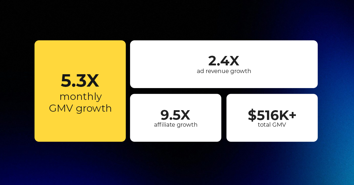
Reading Time: 3 minutes About the Client The Drive Clothing is a lifestyle apparel brand…

Reading Time: 3 minutes Amazon is updating its reference pricing rules in two phases that…

Reading Time: 4 minutes Temu has become a General Member of the International AntiCounterfeiting Coalition,…

Reading Time: 3 minutes eBay has shared early results from its 24 Hours of Drops…

Reading Time: 3 minutes eBay has been revealed as a beta partner in Meta’s new…

Reading Time: 3 minutes Etsy is updating its Purchase Protection programme from 7 May, and…
Reading Time: 2 minutes Walmart is doubling down on creator-driven social commerce, turning influencer content…

Reading Time: 2 minutes In a major follow-up to our earlier coverage — “Amazon Confirms:…

Reading Time: 12 minutes From Etsy policy changes, such as fees and payments, to creativity…

Reading Time: 1 minuteDigital Commerce 360 reports that eCommerce accounted for 25% of total retail…

Reading Time: 1 minuteA coalition of 23 WTO member countries, including the United States, Britain,…

Reading Time: 2 minutes Amazon has announced a 3.5% surcharge for sellers using its fulfilment network…

Reading Time: 2 minutes Amazon has officially expanded its free, box-free, label-free returns network by…

Reading Time: 2 minutes Walmart is bringing Sparky, its proprietary shopping assistant, into ChatGPT, marking…

Reading Time: 2 minutes Visa has rolled out six AI-powered dispute resolution tools aimed at…

Reading Time: 3 minutes On March 26, 2026, the European Parliament and the Council reached…

Reading Time: 4 minutes Kanzen Skincare and six other brands are preparing for what is…
Reading Time: 5 minutes When a seller expands to a new Walmart market, the first…