
EU €3 Customs Duty on Small Parcels Starts Today: What Cross-Border Sellers Need to Know
Reading Time: 2 minutes Intro Summary The European Union’s new €3 customs duty on low-value…

Running short of time? Get PDF of the blog in your mail.
Magento has provided a powerful tool of UI Components to render UI elements like input field, select field, table etc. Many times we face the requirement of having an element dependent on the value of another field in our UI form. We can achieve this without writing extensive js script. Among the varying nodes that Magento UI components provide to apply different features on our ui element, one such node is “switcherConfig” which helps solve our problem of dependency between fields.
As per magento documentation switcherConfig is “Configuration of subscription to a property change of the component that is declared as “target” setting.”
Basically switcherConfig is used to define rules on how we can handle different actions on a target ui element, based on the values of another element. The action callback can be anything, eg-:- we can hide or show the target element or we can make them enable or disabled.
In this blog I would show how we can show or hide elements based on the value of another field element.
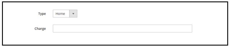
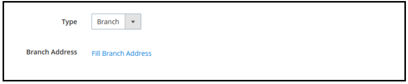
In my UI form I have
And dependable fields are :-
So my rules for these fields are :-
1.My base field “service_type ” in form along with above rules will be like this :-
<field name=“service_type”>
<argument name=“data” xsi:type=“array”>
<item name=“config” xsi:type=“array”>
<item name=“dataType” xsi:type=“string”>select</item>
<item name=“label” xsi:type=“string” translate=“true”>Type</item>
<item name=“formElement” xsi:type=“string”>select</item>
<item name=“component” xsi:type=“string”>Magento_Ui/js/form/element/select</item>
</item>
<item name=“options” xsi:type=“array”>
<item name=“0” xsi:type=“array”>
<item name=“value” xsi:type=“string”>branch</item>
<item name=“label” xsi:type=“string” translate=“true”>Branch</item>
</item>
<item name=“1” xsi:type=“array”>
<item name=“value” xsi:type=“string”>home</item>
<item name=“label” xsi:type=“string” translate=“true”>Home</item>
</item>
</item>
</argument>
<settings>
<switcherConfig>
<rules>
<rule name=“0”>
<value>home</value>
<actions>
<action name=“0”>
<target>${ $.ns }.${ $.ns }.fieldset-name.home_service_charge</target>
<callback>show</callback>
</action>
<action name=“1”>
<target>${ $.ns }.${ $.ns }.fieldset-name.branch_address</target>
<callback>hide</callback>
</action>
</actions>
</rule><rule name=“1”>
<value>branch</value>
<actions>
<action name=“0”>
<target>${ $.ns }.${ $.ns }.fieldset-name.home_service_charge</target>
<callback>hide</callback>
</action>
<action name=“1”>
<target>${ $.ns }.${ $.ns }.fieldset-name.branch_address</target>
<callback>show</callback>
</action>
</actions>
</rule>
</rules>
<enabled>true</enabled>
</switcherConfig>
</settings>
</field>
*Note – Make sure to replace with your fieldset name “fieldset-name” in target
2.Dependable “home_service_charge” input field to define the charges for home service. As the input form element already has a show/hide callback, no extra changes are required.
<field name=“home_service_charge”>
<argument name=“data” xsi:type=“array”>
<item name=“config” xsi:type=“array”>
<item name=“dataType” xsi:type=“string”>number</item>
<item name=“label” xsi:type=“string” translate=“true”>Charge</item>
<item name=“formElement” xsi:type=“string”>input</item>
<item name=“dataScope” xsi:type=“string”>home_service_charge</item>
<item name=“validation” xsi:type=“array”>
<item name=“validate-digits” xsi:type=“boolean”>true</item>
<item name=“validate-greater-than-zero” xsi:type=“boolean”>true</item>
</item>
</item>
</argument>
</field>
3.Dependable “branch_address” a link button to open my pop-up model to define the branch address .
<button name=“branch_address”>
<argument name=“data” xsi:type=“array”>
<item name=“config” xsi:type=“array”>
<item name=“label” xsi:type=“string” translate=“true”>Branch Address</item>
<item name=“labelVisible” xsi:type=“boolean”>true</item>
<item name=“formElement” xsi:type=“string”>container</item>
<item name=“component” xsi:type=“string”>Vendor_Module/js/form/components/button</item>
<item name=“template” xsi:type=“string”>ui/form/components/button/container</item>
<item name=“buttonClasses” xsi:type=“string”>custom-button-class</item>
<item name=“actions” xsi:type=“array”>
<item name=“0” xsi:type=“array”>
<item name=“targetName” xsi:type=“string”>${ $.ns }.${ $.ns }.branch_address_model</item>
<item name=“actionName” xsi:type=“string”>toggleModal</item>
</item>
</item>
</item>
</argument>
<settings>
<componentType>button</componentType>
<displayAsLink>true</displayAsLink>
<title translate=“true”>Fill Branch Address</title>
</settings>
</button>
Unlike the input field, a button ui element does not have a hide/show callback defined in their component js Magento_Ui/js/form/components/button.
So we will have to create our own button component js Vendor_Module/js/form/components/button to add these two callbacks.
Our custom component js will extend the button component js, so that we only have to append our custom callback.
This way we can cover a custom callback along with predefined callback as used above in the input form element.
We will create a button.js at Vendor/Module/view/adminhtml/web/js/form/components.
define([
‘Magento_Ui/js/form/components/button’,
], function (Button) {
‘use strict’;
return Button.extend({
/**
* Show element.
*/
show: function () {
this.visible(true);
return this;
},
/**
* Hide element.
*/
hide: function () {
this.visible(false);
return this;
},
});
});
Results

Reading Time: 2 minutes Intro Summary The European Union’s new €3 customs duty on low-value…

Reading Time: 3 minutes Major global marketplaces, including Temu, SHEIN, eBay, Amazon, and AliExpress, are…

Reading Time: 9 minutes Your buyers are not shopping in one place anymore. They search…

Reading Time: 2 minutes Alibaba’s latest update shows that AI is becoming a much bigger…

Reading Time: 2 minutes Google is expanding AI Mode’s role in eCommerce, pushing shopping deeper…

Reading Time: 10 minutes Did you end 2025 with excess stock and tighter margins, even…

Reading Time: 2 minutes China’s Double 11 shopping festival — the world’s largest annual online…

Reading Time: 2 minutes As global trade enters a new phase of regulation and cost…

Reading Time: 11 minutes Halloween 2025: The Creative Seller’s Goldmine In the age of viral…

Reading Time: 2 minutes Overview AliExpress has launched a new global scheme — the Best…