
Etsy Expands Payments Policy Globally; Instant Transfers Go Live for US Sellers
Reading Time: 3 minutesWhat’s changed Etsy has rolled out major updates to its Etsy Payments…

Running short of time? Get PDF of the blog in your mail.
In the PREVIOUS part, we understood What is Mobile Responsiveness and why it is essential. And this post, as we promised, will be dedicated to what-to-do and what-not-to-do for making your website mobile friendly.So, let’s jump straight to What-to-do part:
What-To-Do For a Great Responsive Design
From the relentless practices of designers & developers, certain practices have evolved, and have proved to be the most basic practices that must be adopted to attain the best degree of mobile responsiveness.
If you’re about to built your website or blog, make sure it’s mobile first. Making website mobile first ensures your website is functioning across all the device screens. Also, Google prefers websites that are mobile friendly in its SERP ranking.
One of the most intriguing factors about Frameworks is that they are tailor-made, and you only have to make some changes to personalize them. And they are as easy as it gets. Skeleton, Foundation 3 and Bootstrap are the popular frameworks. However, the most popular is Bootstrap.
Read Article: Bootstrap Implementation in Magento 2.0
Viewport Meta tag tells the browser that page needs to fit the device screen. Therefore embed Viewport meta tag or, your website won’t work well on Mobile Screens. It prevents unnecessary zooming of the pages thus enforcing pages to impart an app page like experience.
Media query is another feature that contributes to the page fitting the screen size. It allows the browser to ask the device what its screen size is. Also, ensure that it is configured for all devices not just the for the popular two or three devices.
However if defined as 100%, it would fit the layout irrespective of the screens to which it is opened at.
This ensures greater flexibility for your website and the better experience for your users.
Another important or, probably the most important, point is to use simpler designs for your websites. The reasons, firstly, it lets you project only the important aspects of your business leaving out other unnecessary details. And Second is, it prevents the clutter-ing due to unimportant elements and excessive information which otherwise can make the user experience bad on the devices with smaller screen sizes.
These are the points that MUST be implemented to ensure a flawless mobile responsive website. However, there are certain points that must be prevented or they make the overall experience horrible.
Thus, now
What-Not-To-Do For responsive Design
Since Flash is almost an obsolete technology as it doesn’t work great with mobile devices. Restrain yourself from using Flash.
When defining the image size don’t use pixel instead use percentage. For example, if you define the width of an image to be 500 pixels, and you open it on the device whose screen width is 300 pixels, then invariably, you would have to scroll to the right of the screen to view the whole picture, and this distorts your user’s navigation experience.
Keeping these points in mind would help you come up with a mobile responsive website and ensure greater user experience. However, relentless testing in the real world is another thing that can’t be ignored at all. It is an indispensable element of building a compelling web experience.
Now that you’re aware of What’s and Whatnots’ of the mobile responsiveness, in the next blog post we will be discussing how to test your website for mobile responsiveness.

Reading Time: 3 minutesWhat’s changed Etsy has rolled out major updates to its Etsy Payments…

Reading Time: 2 minutesWhat’s changed Walmart has introduced a new Shipping Score metric within its…

Reading Time: 3 minutesWhat’s changed Amazon has announced an additional $35 billion investment in India…

Reading Time: 4 minutesAbout the Brand: 40ParkLane LLC Studio40ParkLane is a design-led print-on-demand brand created…

Reading Time: 3 minutesAbout the Company Brand Name: David Protein Industry: Health & Nutrition (Protein…

Reading Time: 3 minutesOnline retail spending in Germany is entering a renewed growth phase after…

Reading Time: 4 minutesTikTok Shop has released a comprehensive Beauty and Personal Care Products Policy,…
Reading Time: 4 minutesTikTok Shop has formally outlined comprehensive requirements for expiration date labeling and…

Reading Time: 3 minutesTikTok Shop is raising its sales commission for merchants across five active…

Reading Time: 11 minutesBy now you have seen your BFCM 2025 numbers. The harder question…
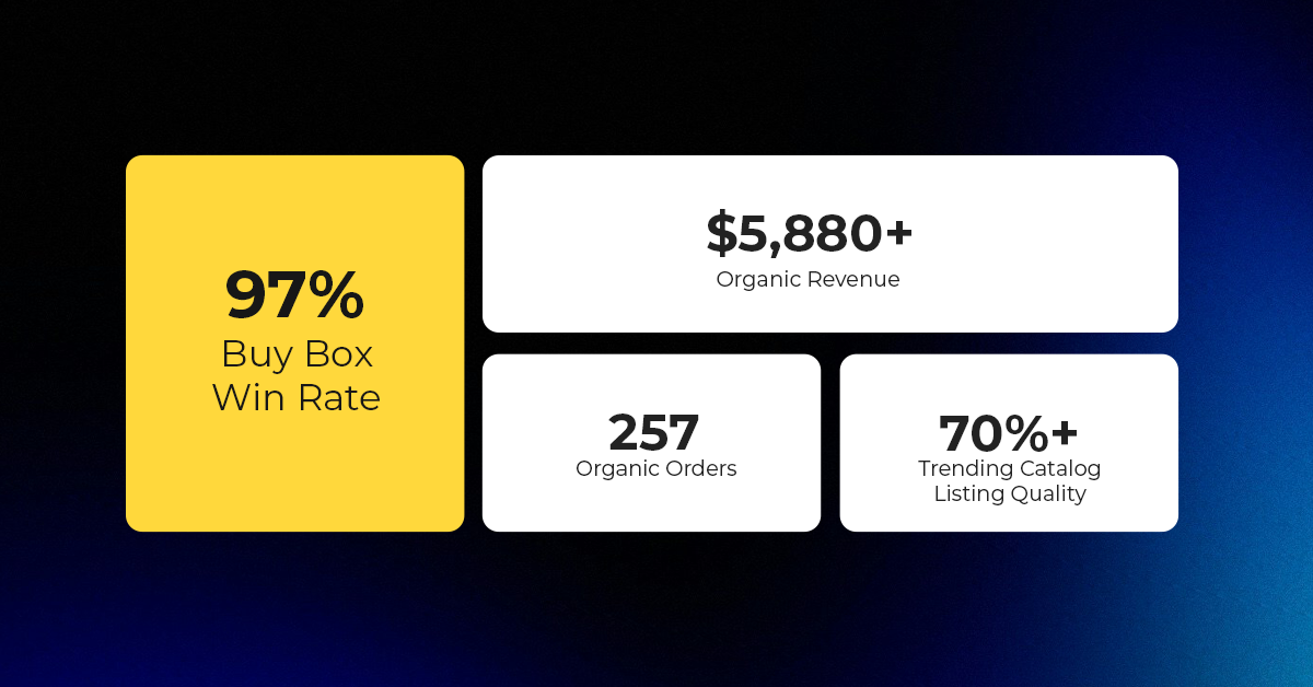
Reading Time: 3 minutesAbout the Brand Name: Vanity Slabs Inc Industry: Trading Slabs- Vanity Slabs…
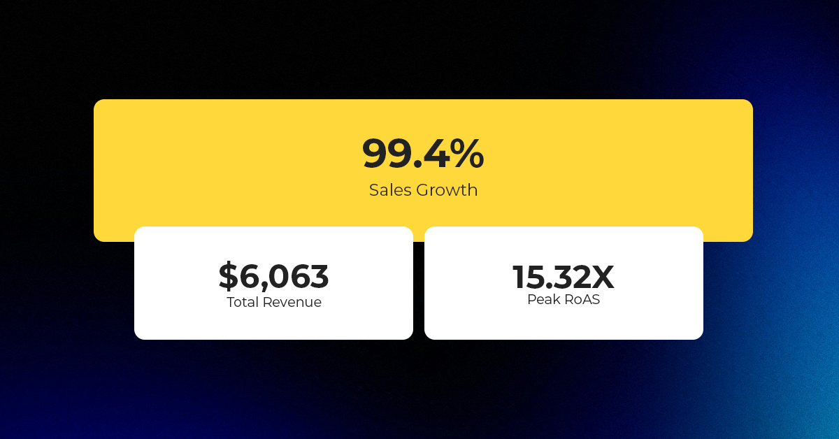
Reading Time: 2 minutesAbout the Brand Name: Ramjet.com Industry: Automotive Parts & Accessories Location: United…
Reading Time: 2 minutesAmazon is rolling out strategic referral fee reductions across five major European…
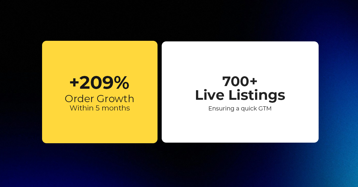
Reading Time: 4 minutesQuick Summary: Scaling Lifestyle Powersports on eBay with CedCommerce Challenge: Zero marketplace…
Reading Time: 4 minutesTikTok has surpassed 460 million users across Southeast Asia, reinforcing its position…

Reading Time: 3 minuteseBay has released its final seller news update for 2025, with a…
Reading Time: 3 minutesAmazon has clarified its stance regarding speculation around a potential breakup between…
Reading Time: 4 minutesWalmart is accelerating its push into next-generation fulfillment by expanding its drone…
Reading Time: 4 minutesFaire, the fast-growing wholesale marketplace connecting independent retailers with emerging brands, has…
Reading Time: 4 minutesB2B buying in the United States is undergoing a fundamental behavioral shift…